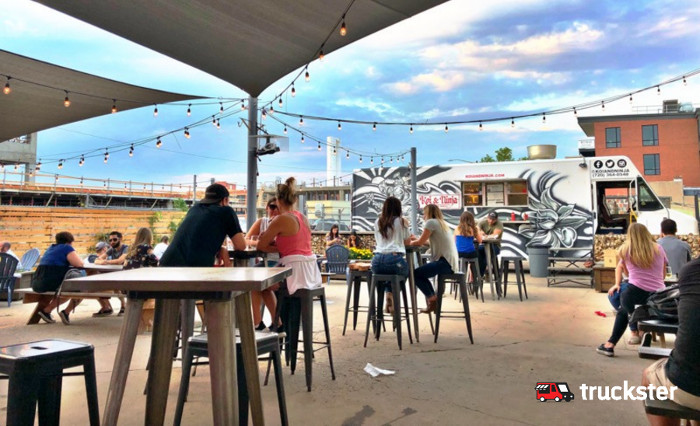
If you want your food truck to stand out and attract a lot of customers, pay close attention to design elements like colors, text, logo, and structure and parts of the vehicle that can add interest. We here at Truckster hope to help you think of ways to come up with a visually outstanding, attractive design that makes your food truck successful.
The appearance of your food truck plays an integral role in your branding strategy, the way people perceive the quality of your products, and your ability to differentiate yourself from your competitors. As a food truck operator, however, your area of expertise lies in preparing food and not necessarily in drawing up a stand-out design.
Designing a Food Truck
In this post, we will be taking a look at five tips for designing food trucks. Keep reading to learn how you can improve your truck’s visual appeal to sell more food.
Your Brand as Design Foundation
There should be a clear connection between your food truck’s design and your brand. If you don’t have a name or logo, develop your branding before you start working on the design of a food truck.
It may be worth asking a professional graphic designer to help you with your branding, especially if you are not the creative type. If there is something inherently authentic about your food, for example, you source all your ingredients locally, work that message into your branding.
Avoid Visual Clutter
It may be tempting to opt for a design that is rich in color, imagery, and text. The problem with this approach is that your brand, name, and central message become obscured and less prominent and memorable.
Instead, only use imagery and text that are relevant to your brand and unique selling proposition. In other words, use one central message. When people see your food truck, they should know immediately what you sell and why your products are authentic.
The text on your food truck should also be easily readable. To improve the readability of the text on your vehicle, use less text, choose a readable font, and make the letters big enough without being overwhelming.
Incorporate Your Food Truck’s Features
All your truck’s features, for example, the windows, bumper, wheels, headlights, and roof can potentially serve as design features. Design elements like lines along the curvature of your truck may also add visual interest. Your food truck’s roof can be a valuable design space, especially if you live in an area with high buildings.
Keep in mind that sliding doors or open windows can obscure your brand message or logo, so make sure that your central message is still clear while your service window is open.
Choose Relevant Colors
Colors are central to your design. The golden rule is to use fewer than five colors and to ensure that every color you use contributes to your branding. You can also use colors to lead eyes to your central message.
Make colors relevant to your customers. If your target market consists of, say, vegetarians, green may be a better color choice than red and pink.
Another important rule when it comes to your design’s colors is to refrain from leaving too much white space.
Use Wraps
Wraps are printed vinyl applied to your food truck’s exterior. Painting your food truck is a viable alternative, but it won’t provide your vehicle with the same exceptional quality finish.
There are several benefits to using wraps: They are durable, easy to clean, and they are considered to be one of the most effective marketing methods. If you work with a professional wrap installer, you can expect your wraps to last for up to seven years.
